Wednesday, 27 November 2013
Development of final outcome
This is my original poster and below are the developments I made:
I developed the bowl by making it look more 3D by curving the top and adding a darker blue as the shadow inside of the bowl. I also made the lines overlap the back of the bowl to give the impression they are coming out from it. I also added the degrees sign on the oven so people don't get confused between degrees and Fahrenheit.
I added a white version of the dotted lines behind the back to make it stand out more from the page and I also added in the eggs at the bottom.
I changed my timer from a timer to a clock that stood out more and showed the cooking time.
I tried out a number of different fonts for my title to help give a handwritten look which suits the style of my poster better. I eventually went with the top one shown above.
Tuesday, 26 November 2013
Developing my initial final outcome
I developed the last step in my design because initially the feedback I got showed that it was not clear enough what the step was telling you to do so I added arrows and an extra spoon to make it clearer.
I decided to add in a code for the amount of each ingredient needed because it was not clear in my diagram:
As my recipe was in cups and teaspoons I came up with symbols for these measurements instead of the words.
I experimented with different coloured backgrounds when developing my design:
I decided to add in a code for the amount of each ingredient needed because it was not clear in my diagram:
As my recipe was in cups and teaspoons I came up with symbols for these measurements instead of the words.
I experimented with different coloured backgrounds when developing my design:
Icon Development
Once I had my final design I made my icons for the ingredients and developed some of them a little further.
Recipe Design Initial Ideas and Development
The first thing I did when designing was to develop the icons for my recipe. I tried a few different versions for most of the icons to help me find the best ideas for each and which ones would work best for the style of my poster.
Poster Initial Ideas
Then I started to design my initial ideas taking some inspiration from my research.
Poster Development
I then developed my favourite idea further before creating my final design.
Recipe Design Research
For my first page of research I found the ingredients needed to make the cookies and then found photographs of each ingredients and clip art images to help me get inspiration when designing.
Next I found out about the history of the chocolate chip cookie like who created it and when and where.
I then found different versions of the same recipe that had extra additions and alternatives in them.
Next I found directions on how the make the cookies from two different websites to check I had the most used method and help me know the order and cooking temps/times when designing.
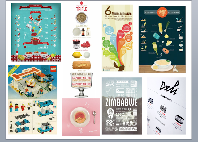
Next I researched infographics some of recipes and some for the inspiration for style and layout. These were really helpful for inspiration when designing.
The image on the top left was the inspiration for the style and colours of graphics in my recipe.
Type Patterns
I created type patterns by taking single letters and placing them over and around one another to create a shape or wrapping them around a shape. I also experimented with colours to make them stand out off the page.
I then used the individual shapes I made to create patterns and backgrounds and mixed different shape together and also experimented with different coloured backgrounds to help the shapes stand out.
Subscribe to:
Comments (Atom)


